Reading time: 12 min.
Color and typography trends in the premium segment
In the premium segment, it is not only the product that determines the perception of value and exclusivity, but above all the visual design. Colors and typography are key carriers of brand impact and send subliminal signals that convey luxury and quality. But what makes a choice of color and typeface special in a luxury context? How do premium brands react to modern trends without losing their timeless elegance?
This specialist article highlights the current color and typography trends in the luxury segment and explains how they contribute to the emotional experience as visual codes.
1. color psychology in the premium segment - more than just aesthetics
Colors are emotional ambassadors. In the premium sector, they are specific symbols for values such as exclusivity, tradition, quality or innovation.
Current color trends in luxury:
- Deep Jewel Tones: Emerald green, ruby red, sapphire blue and amethyst violet represent opulence, craftsmanship and elegance. These deeply saturated colors create depth and a luxurious sheen.
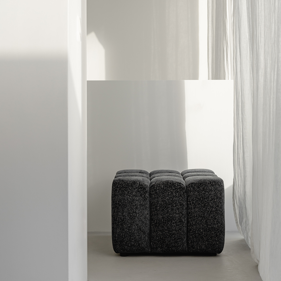
- Neutral classics: warm beige tones, creamy ivory and cool grey as base colors ensure understatement, calm and timelessness.
- Metallic tones and accents: gold, platinum and copper are used as highlights to express value and glamor without exaggeration.
- Sustainable colors: Earth tones (moss green, terracotta) and natural color inspirations reflect the trend towards sustainable luxury.
Use in the brand identity
Color palettes in the premium segment are usually reduced, harmonious and highly recognizable. Brands consciously choose colors that reflect their history and values without appearing too fashionable or fleeting.
2. typography: the art of type design in a premium context
The choice of typeface is a strong voice for the brand. In the luxury segment, it emphasizes the uniqueness and aspirations of the brand.
Typography trends for premium and luxury brands:
- Serif fonts with character: Classic serif fonts convey tradition, stability and sophistication. They are still the gold standard in the premium segment, but are interpreted in a modern way – for example with thinner strokes and generous widths.
- Geometric sans-serif fonts: Clear, minimalist fonts such as Avenir Next or Futura are used as a modern luxury code, especially for innovative premium brands. They radiate clarity and contemporary elegance.
- Handwritten and calligraphic accents: Signatures or lettering in handwritten style lend personality and exclusivity, especially in logos or editorials.
- Variable fonts & custom typefaces: More and more brands are developing their own font families that are tailored to their identity and thus offer a high recognition value and flexibility.
3. harmonious combination of colors and typography
Premium brand communication is all about the perfect interplay: colors and fonts are combined in such a way that they complement and reinforce each other.
Contrasts are set subtly: a strong jewel blue with an elegant serif font in gold creates a high-quality impression.
Like color, typography follows the brand’s guiding principle – whether warm and inviting or cool and minimalist.
White spaces and layout play a major role in giving colors and fonts room to breathe and make an impact.
4. digital trends and challenges in the premium segment
Digitalization is challenging luxury brands to transfer their visual codes online – with all the technical limitations and possibilities.
Colors often look different digitally: bright, vivid tones are more radiant on screens, but also quickly become garish. Luxury colors are therefore often supported by subtle textures or gradients.
Typography must be both legible and attractive on different end devices – variable fonts offer new scope here.
Motion design and micro-animations are gaining in importance to bring color surfaces and typography to life without compromising elegance.
5. outlook for the future: Which visual codes will continue to develop?
Sustainability as a color and style element: natural and organic colors, natural materials and tactile effects are becoming more of a visual statement.
Hybrid typography: combination of classic and digital, tradition and innovation in typeface and logo design.
Multi-dimensionality: layering through transparencies and 3D effects for a deeper visual experience.
Conclusion
Color and typography trends in the premium segment are more than just style issues – they are important communication tools for making luxury an emotional experience. Successful brands know how to combine these visual codes with their identity so that they appear timeless while remaining modern and relevant.
The result is a visual language that not only catches the eye, but also tangibly conveys the values and aura of the brand.